Recently, I was sent galleys for an upcoming co-authored article to be published in POROI. The article, called “Addressing the Social Determinants of Health: “Vulnerable” Populations and the Presentation of Healthy People 2020” is a critique of the limiting definitions of “population” and “resiliency” found in the massive data project compiled by the U.S. Department of Health and Human Services Office of Disease Prevention and Health Promotion (ODPHP) and displayed on the website http://www.healthypeople2020.com Truthfully, when I began researching for the article, I was not entirely sure how data like that found on Healthy People 2020 was used. I imagined the statistical data was just being stored on an online archive. As a humanist, I did not understand the potential data repositories have on material resources for marginalized communities.


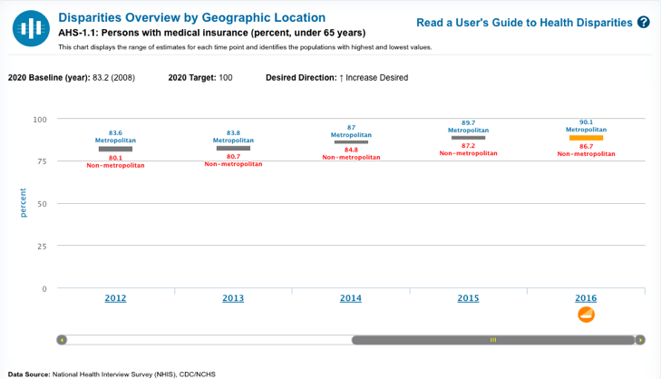
The data, compiled by community organizations, is displayed using various data visualization tools (those of which I do not know or understand yet). For example, if a user sought statistics about the percentage of insured people by geographic area, this is what would be displayed.

At first, I was underwhelmed by how the data was presented. From a user experience perspective, the tool is not all that intuitive and the data that is displayed often isn’t very intelligible to those unfamiliar with reading such data.
Having participated in a few rapid development challenges, I’ve learned a great lesson: It’s easier to judge than it is to build. In true Statler-Waldorfian style, I can easily point out the dehumanization that can occur when populations are presented this way without understanding the complexity of displaying this information.
The data is exportable and ready to be utilized. I imagined I would this data to engage in a story-mapping project. I tried to export geographic data from the tool to input into Mapbox in order to see what the information would look like. Naturally, nothing worked. I tried to export the data using OpenRefine, hoping I could get a CSV of values that I could use over a base layer map of the United States. I thought I would be able to have each state highlight to show the under of insured in each state. Needless to say, it wasn’t so easy and after the better part of a day, I shelved the idea and went back to the drawing board to work on a project that I could accomplish.
The need to humanize data always seemed like the imperative of those who present data to the public. However, it would better serve humanists like me to understand the complexities and limitations of presenting data to the public. It’s not always on the aggregator to provide context, but rather that of a developer, a translator of sorts. The developer as a translator will be an idea I discuss in future posts.