I think there is a point in time that every novice reaches in technical projects when they wonder..will I actually successfully complete this project? This is my current mental state in my CHI project. I am swimming in a sea of technical questions in relation to the map demonstration of macromorphoscopic trait data. My lack of experience using Mapbox has become very apparent and my ideas of how I would visualize my data and present this concept to my audience are ever-changing.
Initially, my intention was to generate a single heat map that could filter through a series of macromorphoscopic traits and their various trait expressions to depict scores densities across space. Several realizations occurred that have changed how I will have to present these data. First, I realized that due to the nature of my data, I will not be able to create a heat map in a way that is meaningful. The geographic location information per individual is generalized to the country in which the individual resided rather than specific coordinate information. This means that a choropleth map will be more appropriate for presenting trait score distributions. In order to create the choropleth map, I need to be able to cross-reference country codes between the map and the macromorphoscopic trait data. The map will need to have countries previously coded and defined so that country names will be recognizable in the datasheet in order to be properly linked.


My next realization was that having multiple traits with multiple trait scores on a single map would be difficult to code to filter properly and potentially create confusion for the user. Having separate maps for each trait will allow the user the scroll through the score distributions of a single trait by one trait score at a time. (See image below for example of how these traits are scored. You can see that Anterior Nasal Spine (ANS) can be scored as 1, little to no projection, 2, moderate projection, or 3, marked projection. The individual is assigned and ANS score of either 1, 2, or 3.) This will not only simplify user experience, but it will also allow the user to view multiple traits side-by-side to determine if there are any noticeable patterns in human craniofacial variation across space. Observing patterns in the data will allow the audience to reflect upon and hypothesize about possible climatic and genetic forces that may be influencing trait expression.

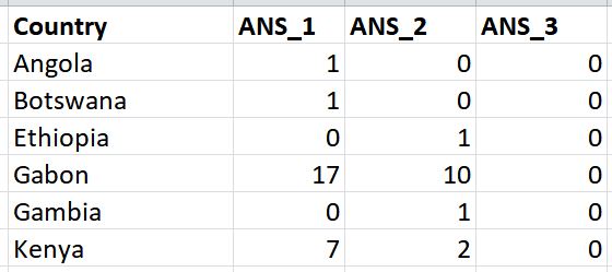
Now that I have established a new path for the data visualization component of my project, I need to learn how to perform the technical aspects. Particularly, I need to determine how to structure my data. My data is currently in a single CSV file so that it can be easily imported into various programs. I will need to first create 5 new data files, one file for each trait/map that will be presented on the website. Then I need to decipher how Mapbox requires data to be formatted to create a choropleth map. For example, the data currently lists data by the individual with their associated country and a series of trait scores (Table 1). I believe that after creating new documents with only one trait per datasheet, the data will then need to be summarized by country of residence and trait score (Table 2). This will create the appropriate format for dialogue boxes to be displayed for each country with trait frequencies per score and simplify the user filters to display one trait score distribution at a time.


Overall, I am working to knock through the proverbial wall and start making some rapid progress on the map component of the project in the upcoming weeks. I have written much of the website content and am excited to complete the project and begin sharing it with others.