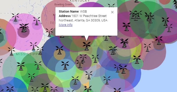
Today marks the official launching of Visualizing Southern Television 2.0, the second version of my project digitally mapping the footprint for television stations in the south between 1946 and 1965. Back in June, I began the process of deconstructing the mapping infrastructure of VST with three main goals: to improve the aesthetics of the mapping system, to introduce a visual representation for station signal range, and to visualize the estimated reach of each tower’s broadcasts, over time, in order to show which geographical areas were within the reach of any given broadcast signal.
Since beginning this process, I have rebuilt VST’s design architecture from the ground up in order to correct two major narrative discrepancies with 1.0. Relying heavily on GeoMashup, 1.0 told a static story of transponders’ locations. VST 2.0 expands that vision to include each transponder’s reach not only in 1946 and 1965, but also in every year between. Visualizing Southern Television 2.0 tells the dynamic story of southern television’s roots, from 1946 through 1965, as it grew into a dominating industry.
Although I am still updating station data as I run across it, the infrastructure of the website remains the same. As projected at the beginning of this project, each station on the visual interface is still a representation of data hosted on a single WordPress post . What has changed substantively is the mapping interface presenting this data. Abandoning GeoMashup, I needed a new, user-friendly mapping system to present the data, and had been intrigued by an original mapping infrastructure I had seen used by my brother, the linguist Wilbur V. Bennett, to map dialects in Louisiana. With his permission, I began adapting that mapping system using the Google Map JavaScript API to present station information superimposed on top of Google Maps. The script uses a TV signal pin to mark the television transponder’s location, and a radius overlay to document the estimated reach that the station’s signal could be received. The coloration is randomized to allow users to distinguish between various stations whose signals might overlap. The mapping infrastructure also has a timeline bar at the top that allows the viewer to filter the displayed data by year created. This allows the viewer see the chronological, as well as geographical, reach of television stations. All of this has been embedded into the WordPress framework to maintain consistency and usability throughout the website.
Although this concludes my time with Cultural Heritage Informatics, I invite you to keep following the site’s progress over the next few years, as I plan to continue updating its infrastructure and adding station data as I come across it in my research.
